
Stepper
Stepper is a component that serves as both a visual and functional guide, representing customer's progression through a series of sequential steps.
Problem
The previous iteration of the Stepper component faced several functional and design limitations:
Scalability issues: It was built for smaller business datasets and was not adaptive.
Poor user experience: The design was "greedy with space," offered a suboptimal reading experience, and featured confusing navigation.
Lack of clarity: The status of a step was not clear, and users did not always understand the sequential order required for forms.
Technical rigidity: Adding new steps to a flow was a jarring experience.
Solution
The new Stepper component was designed to address both user goals and design efficiency:
User-centric design:
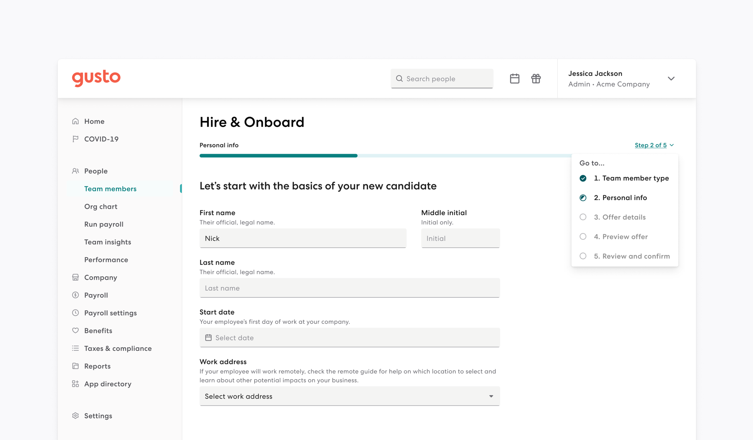
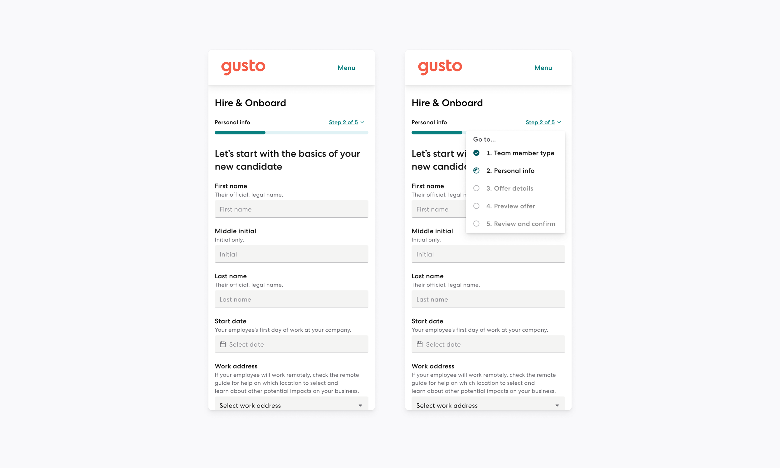
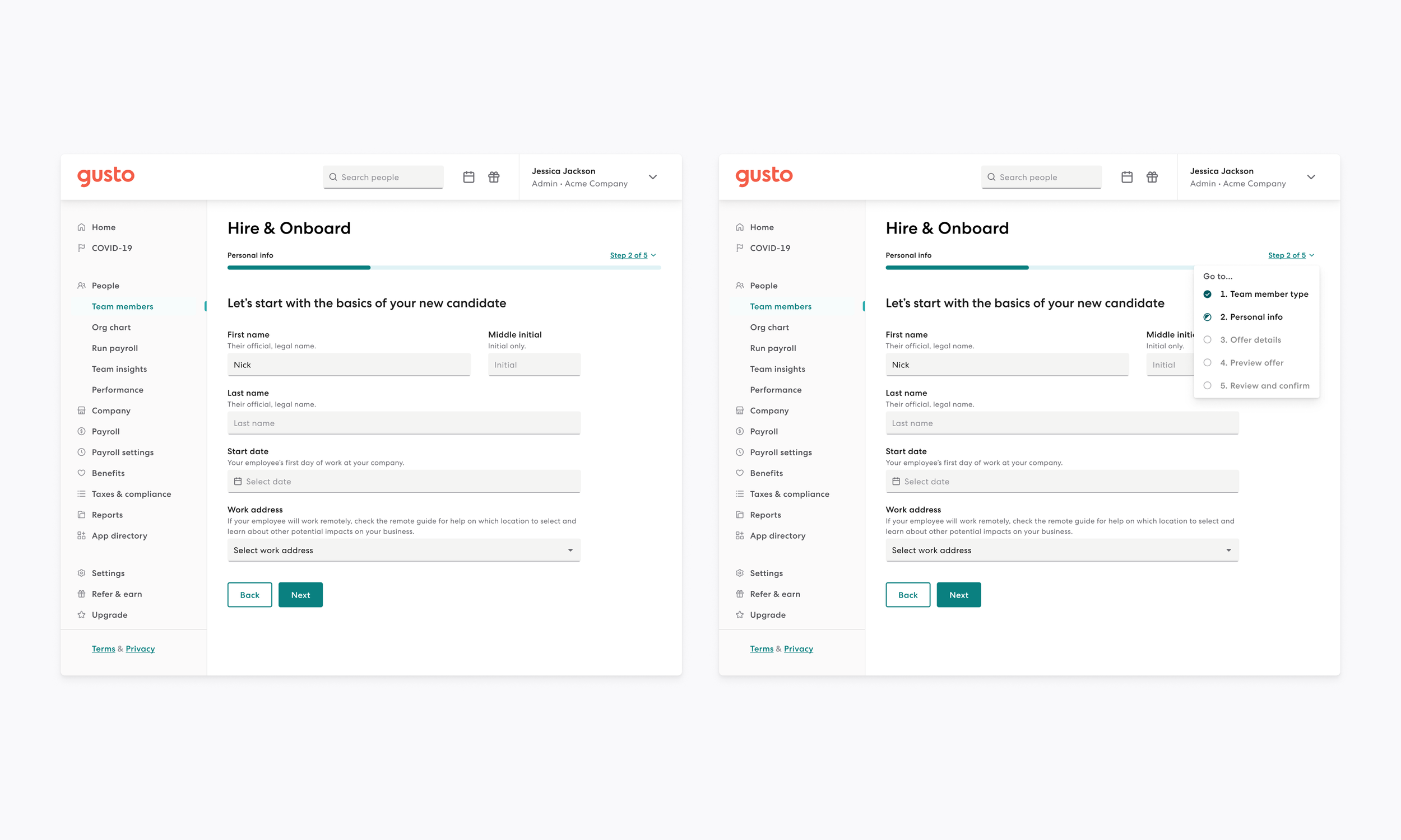
Provides clear visibility of the current step, total steps, and finished steps.
Clarifies the status of each step and ensures sequential order by disabling navigation to future steps.
Focuses on an accessible, inclusive, and user-friendly experience.
Technical & Visual Optimization:
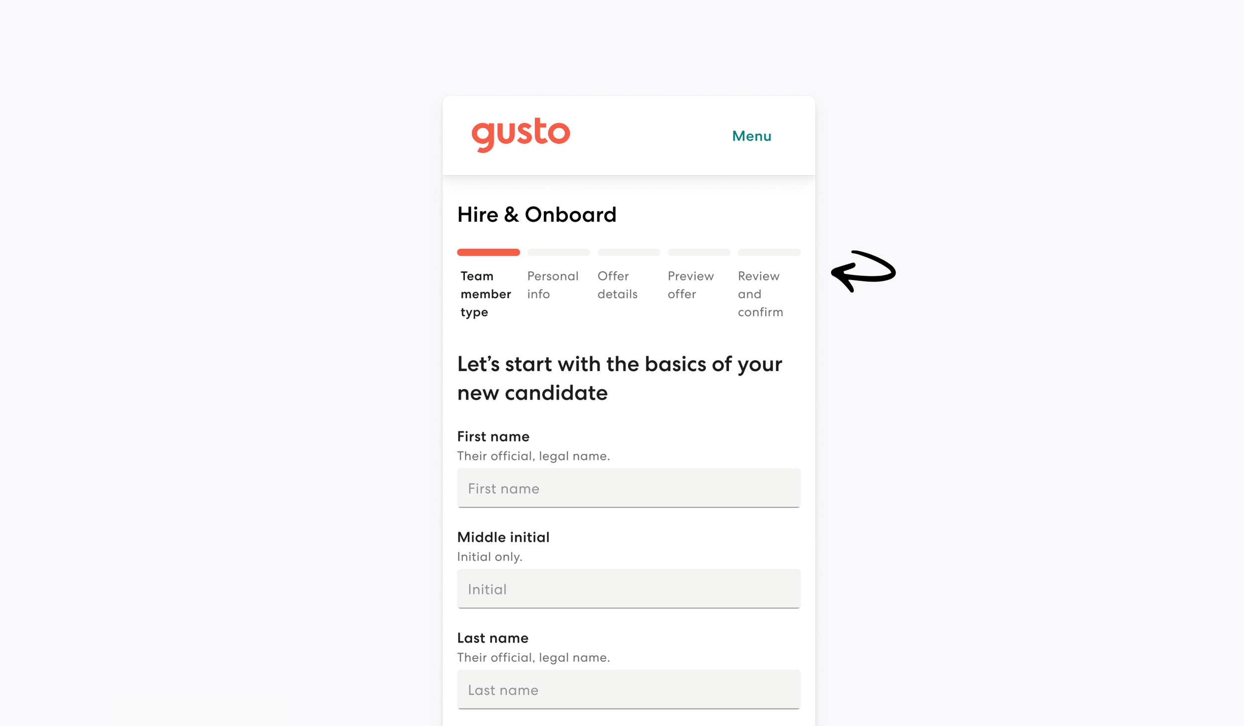
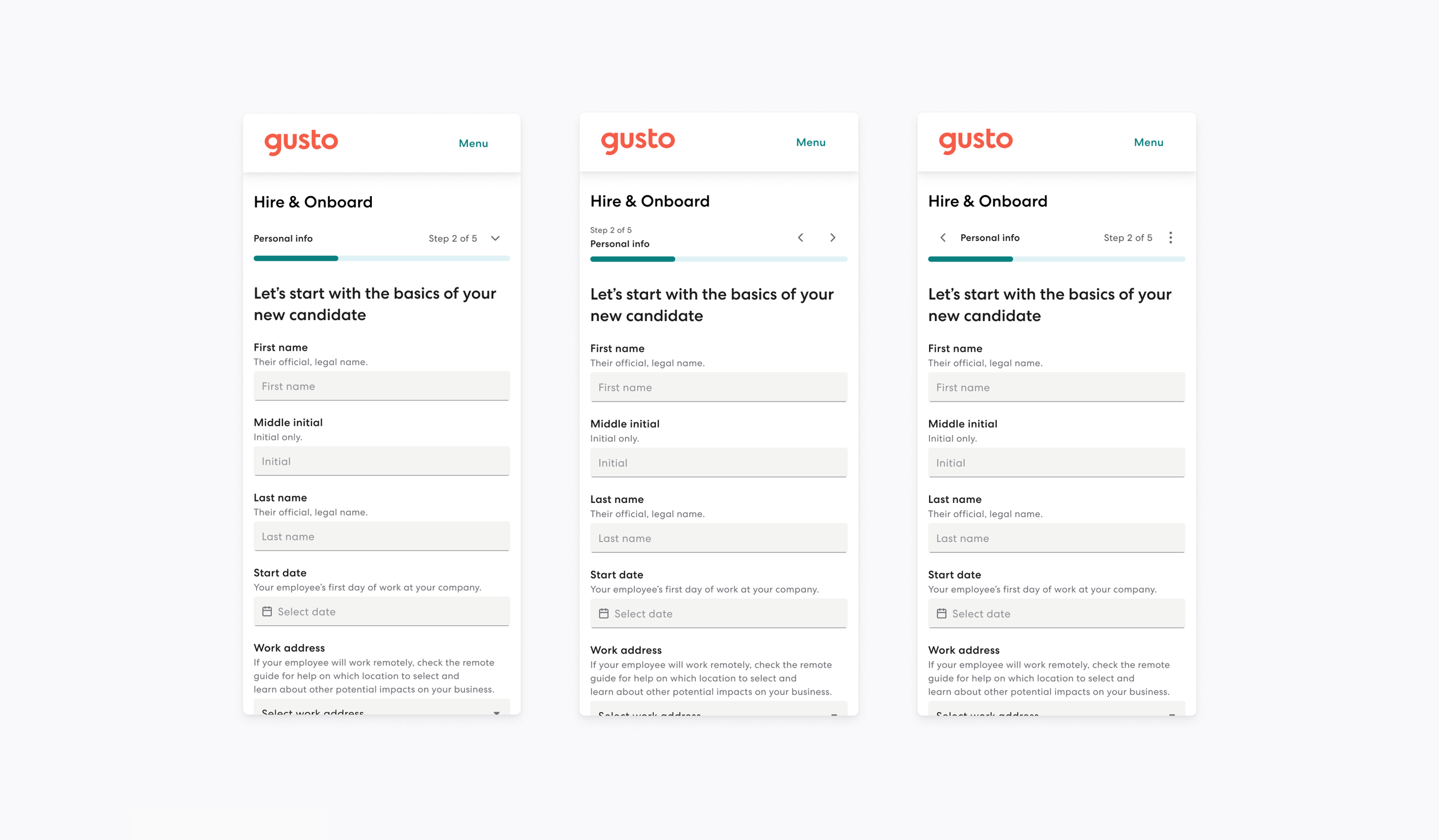
Created a design that is conservative of space and works across all breakpoints.
Developed a seamless solution for adding steps to existing flows.
Business alignment:
Created a scalable solution that supports migration and maps back to company OKRs for medium to large businesses.
Impact
The implementation of the new Stepper component yielded significant results within just four weeks:
High adoption: The component reached 72 instances in Figma utilized by 5 teams across 24 files.
Broad implementation: It achieved 52 usages across various teams within the codebase.
Operational success: The component successfully supports complex, adaptive user flows and provides a more scalable design solution for larger business needs.
Problems: Where we began
Built for smaller businesses datasets.
Not adaptive.
Addition of steps is jarring.
Greedy with space.
Confusing navigation.
Status of a step is not clear.
Suboptimal reading experience.
Sequential order is not always understood.
Audit
Ran both internal & external audits.
Reviewed designs at both large, medium, and small breakpoints.
Looked at user interaction across all breakpoints.
Captured best accessibility practices.
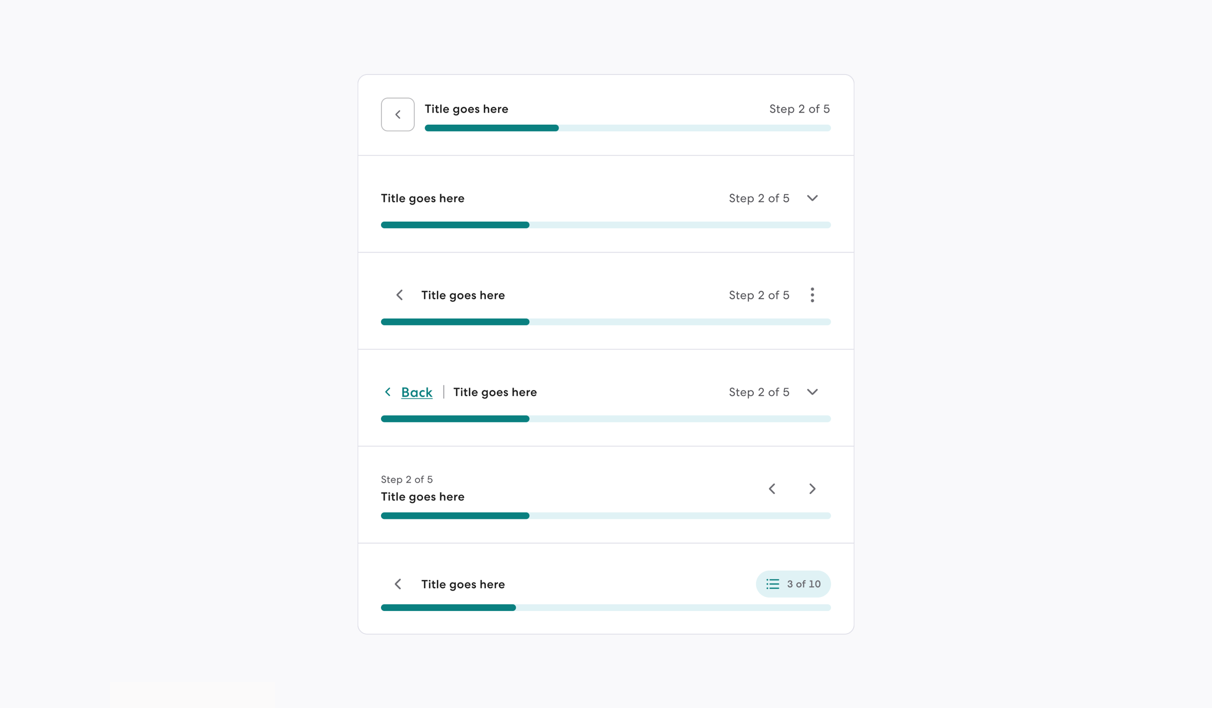
Design: Visual Explorations
Design explorations include:
Button types - regular button, icon button and chips.
Different hierarchy.
Different text placement.
Different user experiences and interaction.
This ties back to:
Step consolidation.
Adapting to user input (adding steps).
Showing progression outside of visuals.
Vertical space consideration.
Icon usage.
Affordance.
Navigation.
Color.
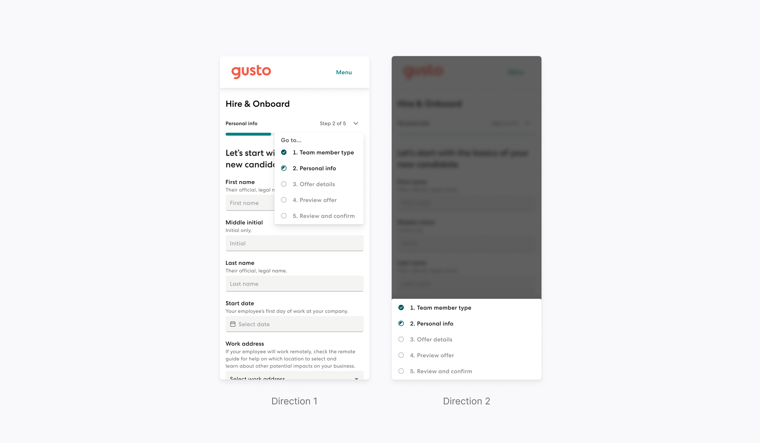
Design: Interaction
How is the menu activated and is it done in a compelling and understanding way?
Does this experience differ on desktop and mobile web?
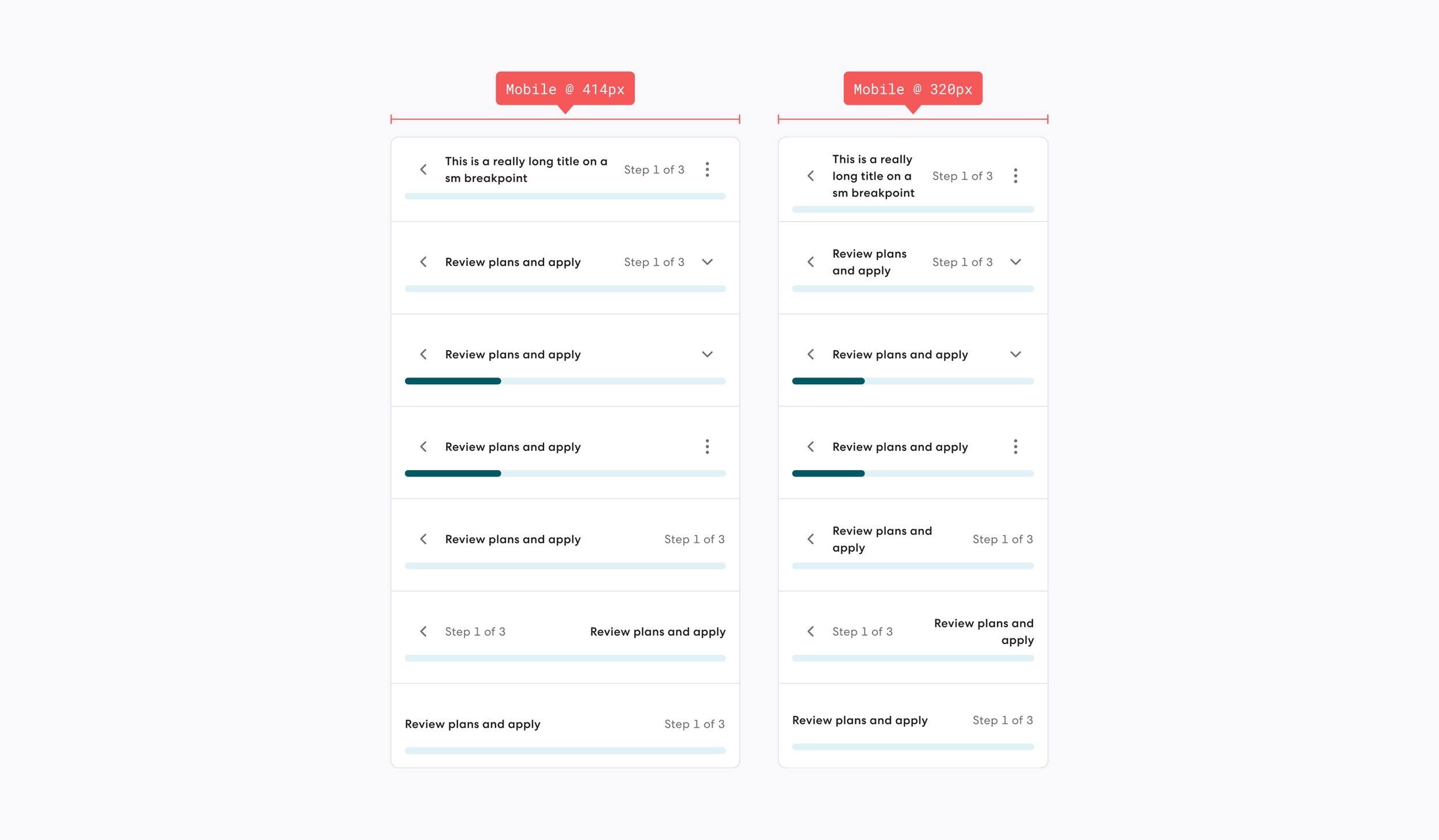
Design: Stress testing
Testing edge cases at mobile/small breakpoints for the following items:
Long title.
Text wrapping.
Impact to height.
Impact to icon placement.
Impact to reading experience.
Icon usage for the following:
Complete.
Active.
Inactive.
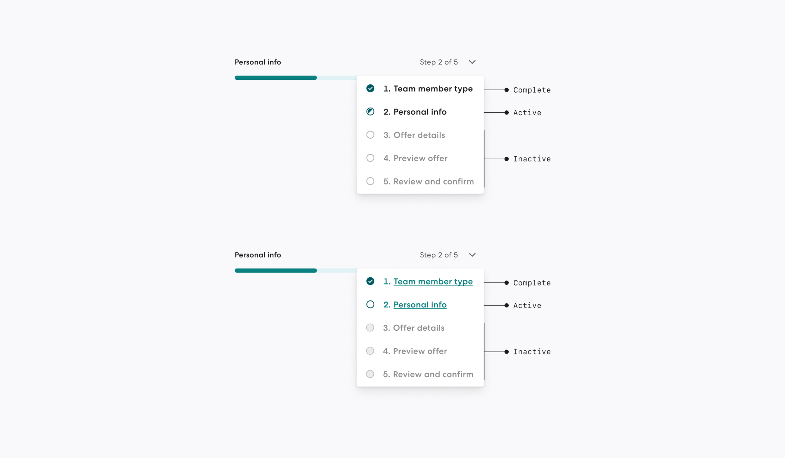
Link styling
Salt (Black).
Kale (Green).
Including a title above the menu.
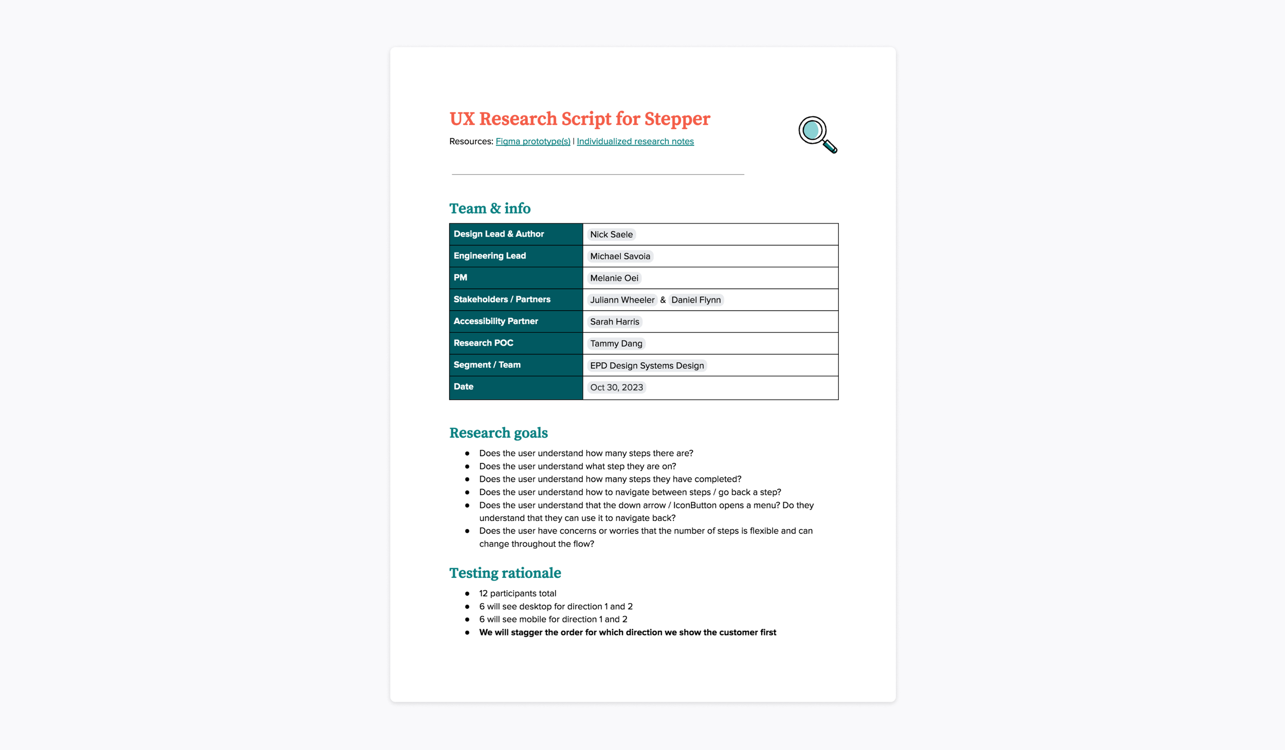
User research
I worked with UXR to test two directions on both desktop and mobile web.
Research goals:
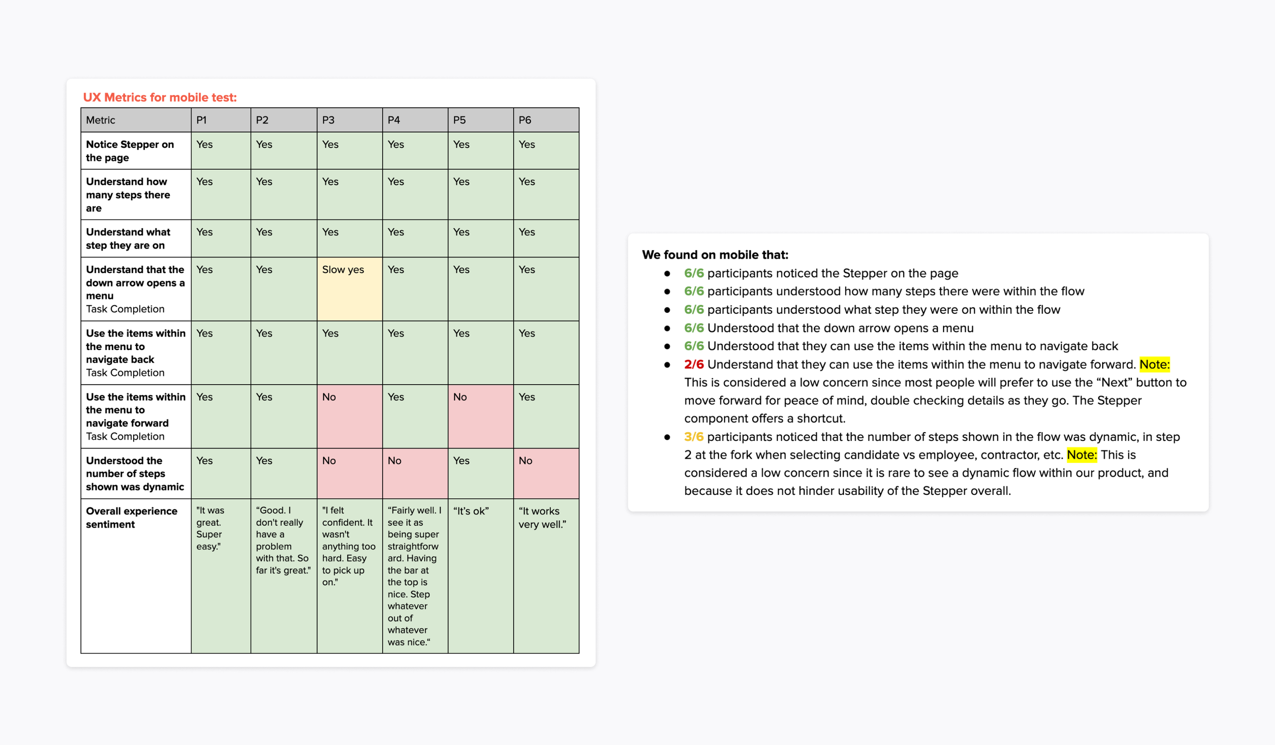
Does the user understand how many steps there are?
Does the user understand what step they are on?
Does the user understand how many steps they have completed?
Does the user understand how to navigate between steps / go back a step?
Does the user understand that the down arrow / IconButton opens a menu? Do they understand that they can use it to navigate back?
Does the user have concerns or worries that the number of steps is flexible and can change throughout the flow?
Problems faced:
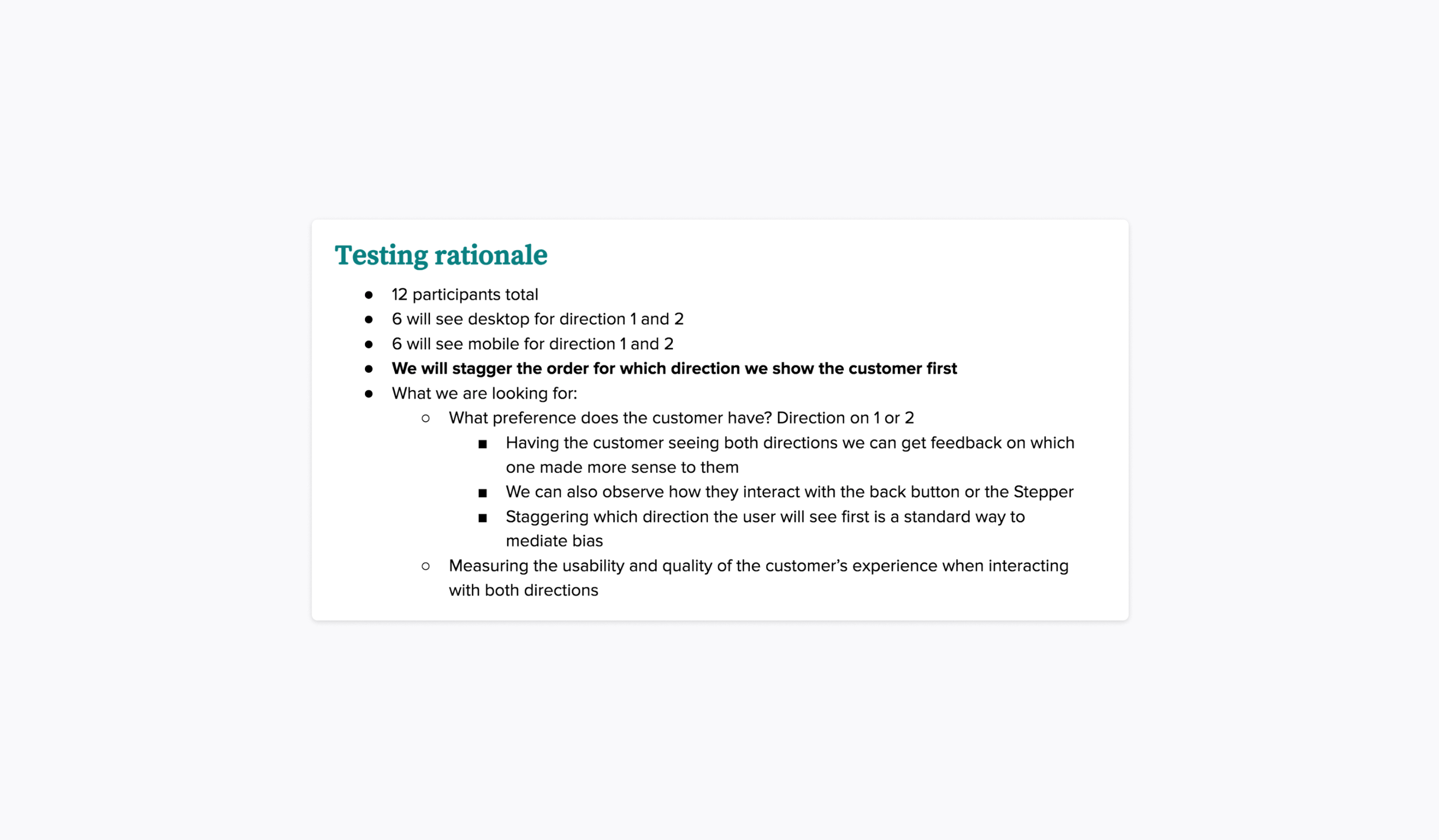
A big challenge we faced was not having enough budget to test with as many customers as originally intended. As a work around to this problem we decided to stagger the order for which direction we showed the customer first so we could mediate bias.
Results:
Both directions tested well.
All participants were able to complete the assigned task successfully.
All topics concluded in a ‘No’ or low numerical count are not concerning due to no impact on the user experience or ability to complete a task.
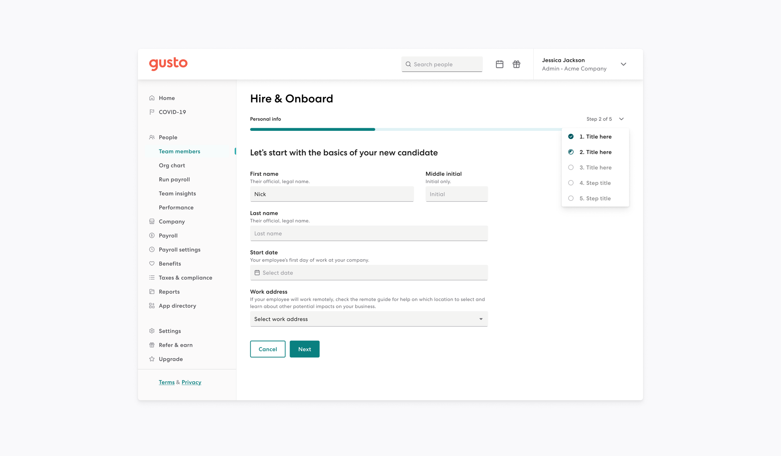
Chosen direction & outcome
The green underlined link styling for button provides more affordance that it’s interactive.
‘Go to...’ title above the menu provides more affordance that the child items can be used for navigation.
Simplified UI with stronger UX that will work well at all breakpoints.
Updated design takes up less vertical space.
Adapts customer input by allowing steps to be added to the flow in a less jarring manner.
Documentation
On Workbench we address the following within documentation:
General documentation:
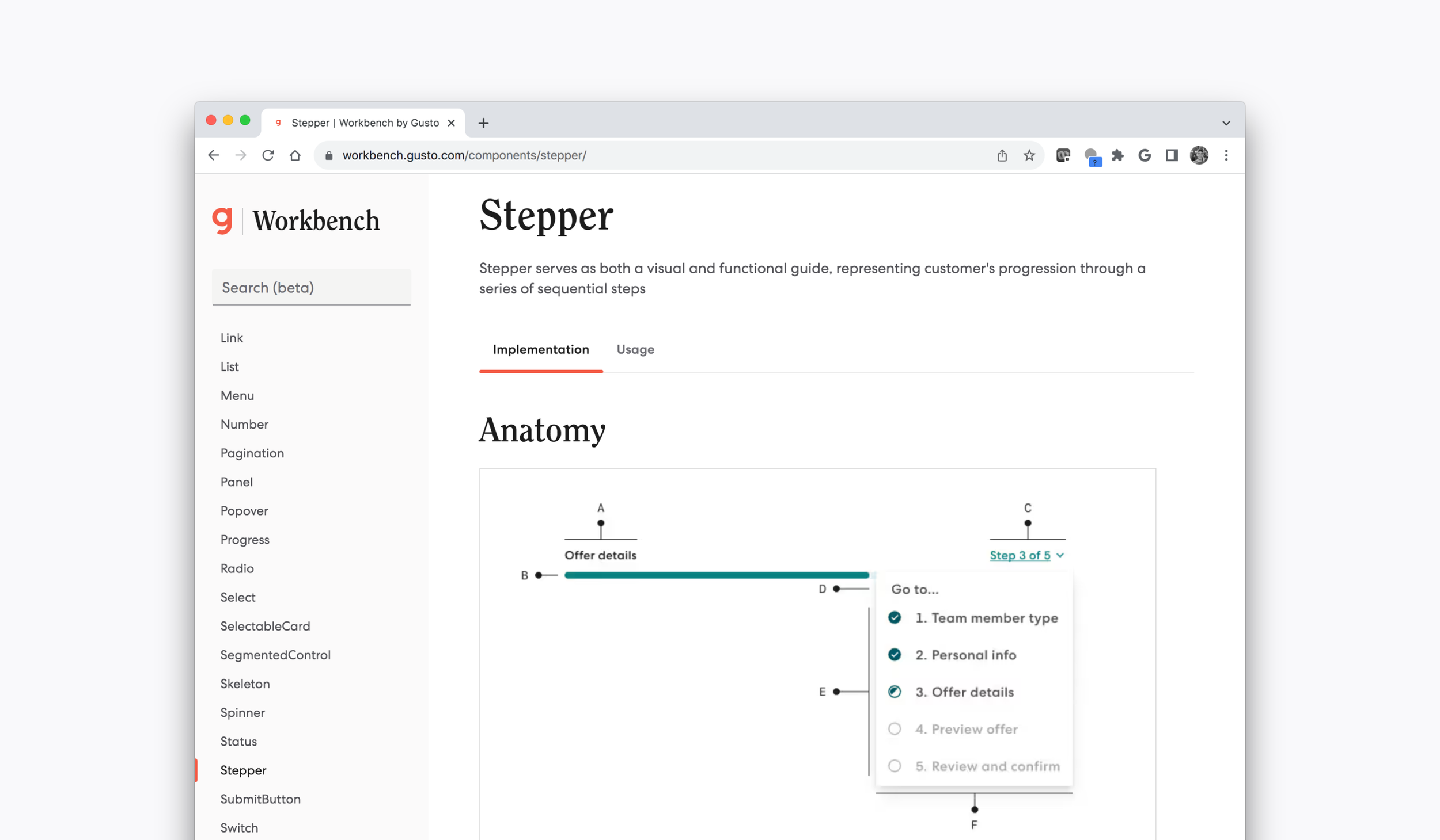
Anatomy.
Examples.
Props.
Development responsibilities:
Accessibility.
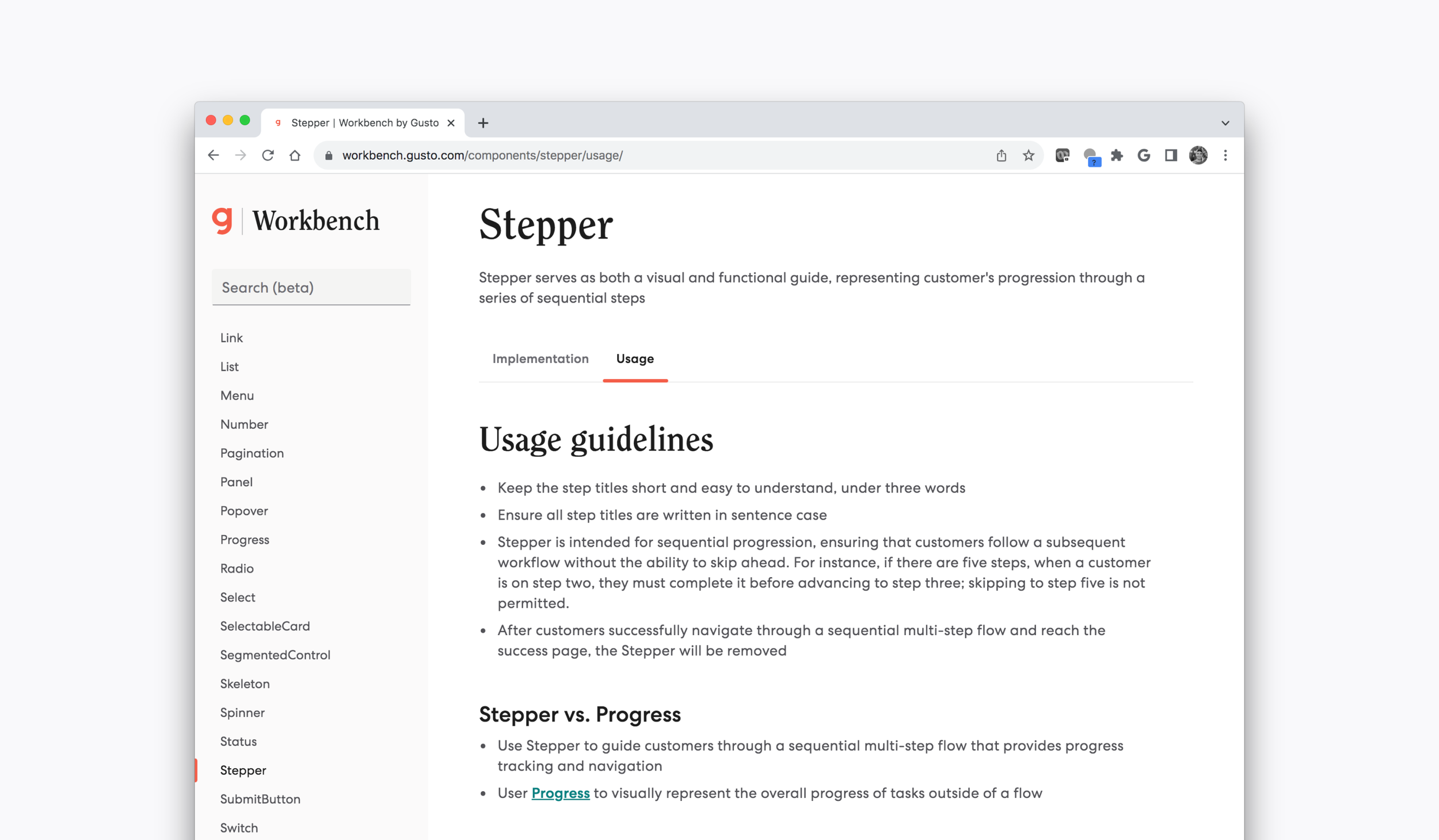
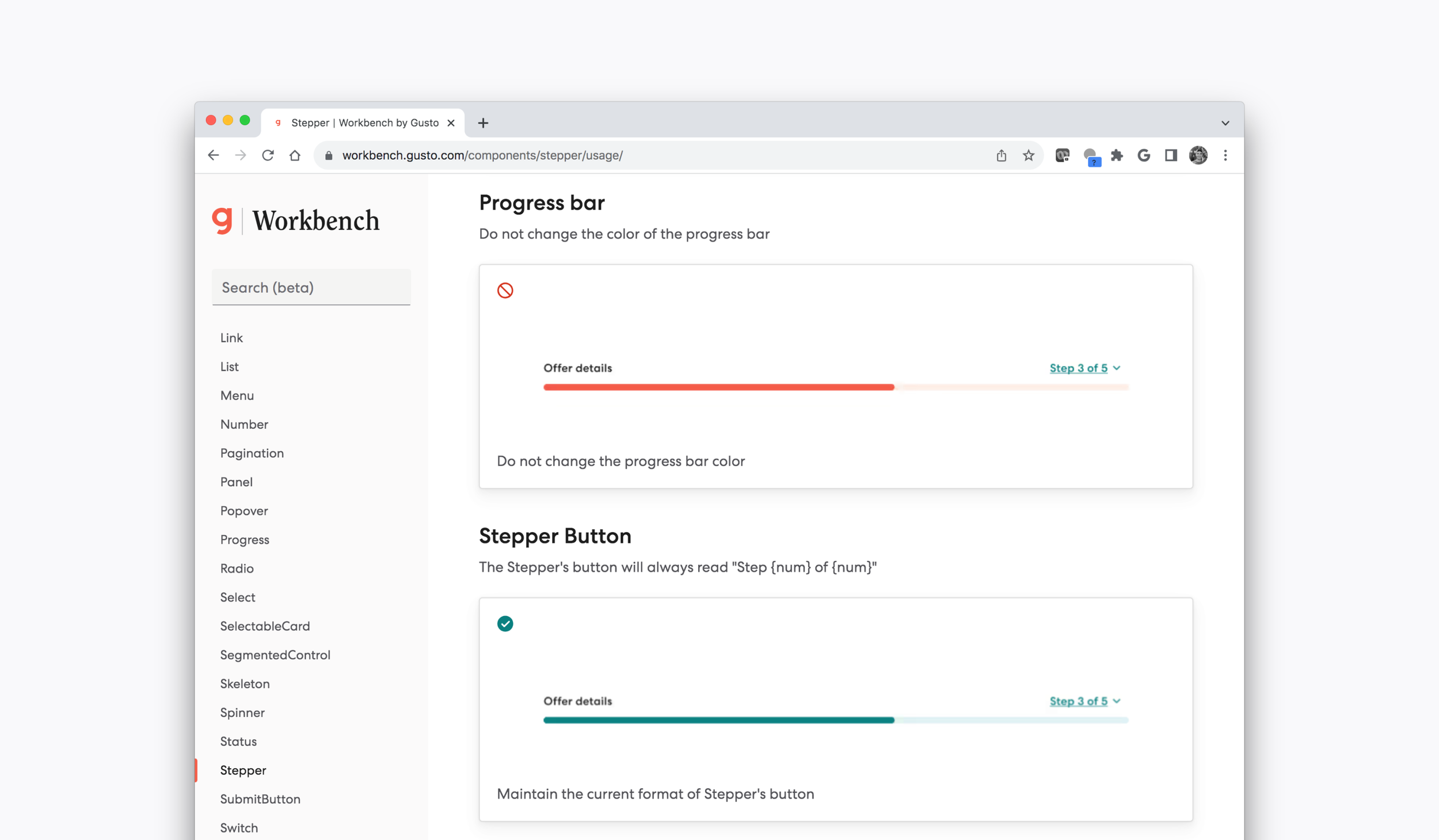
Usage guidelines:
Key takeaways.
Component similarities.
Do & don’t examples.
Specific component documentation.